We use cookies to ensure you have the best experience on our website. If you continue to use this site, we will assume that you agree with our
Privacy Policies , Use Terms
and cookies.
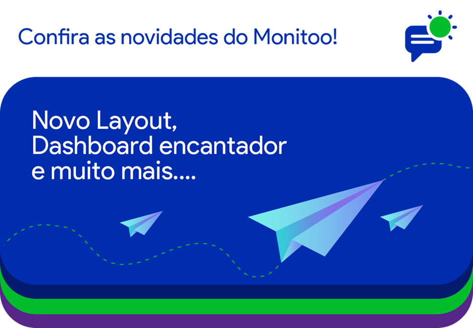
We are excited to share some news about Monitoo. After analyzing customer feedback, we have decided to make significant changes to the layout and add new features aimed at further improving your experience and aiding in productivity analysis.
We recognize that your opinion is extremely important at this time and will contribute significantly to the improvements. Therefore, we would like to highlight the main news that has been implemented:
New Layout
New identity and a functional Dashboard!
Monitoo's new design was developed based on our users' suggestions, aiming to make navigation more intuitive and enjoyable.
Updates
Report corrections and instabilities!
A series of updates have improved sensitive data to obtain crucial workforce planning metrics for your business in 2024.
New Features
Powerful features for your analysis!
The new features will help you get the workforce insights you need to make confident decisions and make decisions that lead to better results.
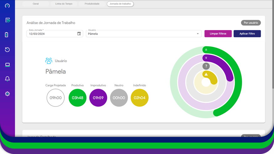
This feature presents the total hours the computer was monitored compared to the projected load, as registered in the company's workday, and can be viewed by department or user.
It also separates the hours according to the registered classifications: Productive, Unproductive, and Neutral. Additionally, it calculates a productivity score for analysis.
Productivity Dashboard
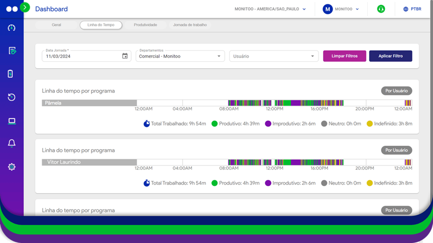
Analysis by department or user
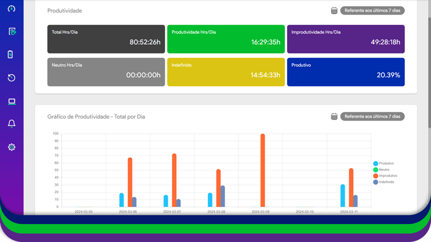
Allows for a weekly and daily analysis for the last 7 days. This feature presents the total hours used, distributed among the registered classifications as Productive, Unproductive, and Neutral. It includes a productivity percentage, allowing analysis by user or department.
Timeline Dashboard
Hour-by-hour activity breakdown
This feature consists of a graph that displays, by hour, the use of programs according to the classification registered as Productive, Unproductive, and Neutral.
See a daily breakdown of time spent on productive and unproductive activities, and productivity trends by week, month, and year. Understand the average working hours to ensure alignment between dispersed teams.
Your feedback is very important so that we can continuously improve the features available on Monitoo, so feel free to explore the new features and share your opinions with us.
Stay tuned for the next emails, we will share tips and guidelines for setting up the software and getting the most out of our improvements and new features.

 info@monitooapp.com


 Talk to us
 Request free trial